Population Proportional Meshblocks
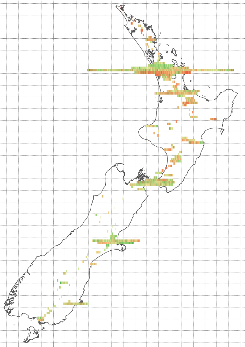
My last map visualised the NZ deprivation index by meshblock. It provided a quick regional overview of deprivation however it obscures the effects of population density. This week I wanted to explore different ways to present the NZ meshblock dataset that emphasises population distribution over geographic location.
This map is the result of using a modified meshblock dataset I created with the same deprivation data. The size of each block accurately reflects the size of the population, and the position of the block is weighted to the mean location of the population horizontally.
Each 'row' above contains all meshblocks quantized in to 10km bands (north/south) with a width of 1 metre for each 'population resident'. The grid is 50km square, so a band that is one square wide represents 50,000 people, and a full grid square would represent 250,000 people.
This is an interesting way to arrange the meshblock set. It works reasonably well for New Zealand where the country is roughly north/south aligned, giving an idea of how the population is distributed and retaining useful reference points for comparison. The blocks are a bit small, a problem that is difficult to fix given the uneven population distribution.
Downloads
You can explore and download the modified meshblock layer I created for this map here:
Datasources
- New Zealand 2013 Clipped Meshblock Boundaries (Statistics NZ)
- NZDep2013 Meshblock Data (University of Otago)