Auckland Employment Centres
A recent Auckland Transport Blog post highlighted one of my biggest bugbears about misleading cartography - using fill symbology from absolute values that are dependant on the area of the underlying polygons. It seemed like as good excuse as any to try out hexbinning as an alternative method of looking at the data.
The analysis in the post looked at the "Geometry of Urban Labour Markets" and is seeks to find patterns of employment as it relates to transport in the city. Here is the original map:

Employee count by Auckland area unit, 2014 - Auckland Transport Blog
The data is based on Statistics New Zealand employee count estimates for census area unit (AU). The problem is that the size of an area unit is roughly proportional to normally resident population. So what happens if we provide the light to dark symbology in this map? Well it looks like Mangere South (the dark blue block to the south) is the biggest employment centre in the city, with other the other most significant areas outside of the CBD in industrial areas like Otahuhu and East Tamaki.
Is that true? It's not surprising that a lot of people work in those areas - they're large areas of industrial land. Mangere South includes the Airport and its environs. The problem is the data is skewed: few people actually live there, so the AU is particularly large. Practically speaking it means that industrial areas will appear more significant (a square-ish relation) than other areas of high employment with larger resident populations (e.g. the CBD and regional centres, commercial and mixed areas).
If you're talking about transport and planning, this is a pretty important distinction.
If you want to compare absolute values between variable geographic sizes, you need to look at density. Fortunately this is easy in most GIS packages - just add a new field and fill it with the absolute value divided by the calculated area of the block.
In QGIS you can go the the attribute table, enable layer editing, hit the field calculator and add
a new calculated field with the formula "value_field" / $area. Symbolize with gradients based on
the density value and you have an easy way to compare AUs of different sizes.
But density might not be the easiest way to visualise the data or to start clustering areas to find patterns. This is where hexbinning - aggregated values over a regular grid of hexagons - comes in.
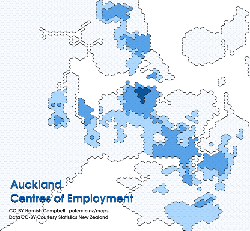
In this map, I've created a hexbin layer using the handy MMQGIS plugin. After calculating the employee density for the AUs, I've mapped the mean values to the hexes, and highlighted the hexes to show where the most dense employment areas in Auckland exist. The top 20% by density are highlighted, with a roughly logarithmic scale for the top 20% from light to dark.
Now you can start to see where the centres of employment exist, and what those centres look like. The CBD is - by far - the biggest centre of employment in the region, but an awful lot of people work close to the CBD. The surrounding suburbs are not-insignificant employment regions in their own right. Rosebank, New Lynn, Henderson, Takapuna and Albany show characteristics of a composite model of development, and to the industry south-east we see a far more dispersed pattern.
Unfortunately there is one significant issue with my approach: the resolution of the hexes is significantly higher that of the original AUs in some areas. This is highlighted by the missing expected zone of employment around the Airport. While the map reveals the Mangere South AU is actually (in aggregate) a region of low employment density, we also know that employment there is actually considerably more concentrated within the AU than the map implies.
It means the Statistics NZ data is, in my opinion, inappropriately aggregated. We simply can't pull fine-grained information about employment patterns in places where very few people live (but many people work). If you have suggestions on how that situation could be improved, leave a comment below!